Creating a robotic vacuum app which corresponds with user needs
During my work at Robart, I was responsible for setting the direction of the app, including feature planning, proposing implementation, UX and UI concept evaluation. Together with my team, we did a lot of A/B testing, beta app testing, and evaluating existing features or implementation with current users.
Leading team
Planning
Managing
Evaluating
UX design
UX research
Feature development


Romy Robot design system
When there are multiple designers working on the same app it is important to keep an unified system which defines and provides components, font styles and patterns which have already been set and validated. For Romy Robot the design system was a wise step to establish rules for already long-time existing app and provide necessary information for the App team to unify the app screens.
Main role:
-
Audit of the previous app version regarding color contrast, icons, navigation and assets
-
establishing and introducing Design System
-
leading the UX team and App team through the changes
-
managing external graphic designer (Sonia Furmanek) for app illustrations
Note: the current version Romy Robot app does not contain all the changes due to App and UX team shortage.
01
Design audit of the old app
The challenge
When joining Robart company I was challenged with the already existing app Rob-Connect designed without a design system or UI rules. There was no definition or system describing when the colour, font or icon should be used. The distances between elements were not fixed and the app looked old-fashioned. Implemented concepts were not validated with the users and new features were just added to the existing screens. For many years there was no focus on the app and the importance of user experience was not recognized.
As I became a UX lead in 2021 my first step was to improve the UX and interaction in the app and then move to UI changes to make the app look more fresh and friendly.


02
Romy Robot - building design system
The first step was to review and collect the various styles and components among app screens, as well as create a screen flow. The second part was to evaluate where the change can be done to improve the usability and UX of the app.
Bringing order to chaos, the Romy Robot design system is a collection of reusable components, colours, icons and more, that can be assembled together to build new screens or feature implementation, and enable an easily scalable, efficient, and consistent system throughout the app. Additionally, it brings value to any customisation of the app, by clearly defining guidelines and flows.


Colour and contrast
- Case Study
As Romy Robot colours for the app were given and designed mostly for print, there was not enough research done before implementation which would investigate whether the contrast and accessibility is enough for the audience.
After completing in-home use testing we found out that for some people accessibility to the app is poor due to low contrast between elements. Another factor which brought us to conduct colour and contrast research was an overall opinion about the app perceived as 'old fashioned'.
The main challenge was to pick colours with proper contras which correspond with the newly established brand of Romy Robot and already manufactured elements.
Main role:
- conduct research about colour and contrast
- propose a different colour scheme
- introduce new colour scheme to other teams


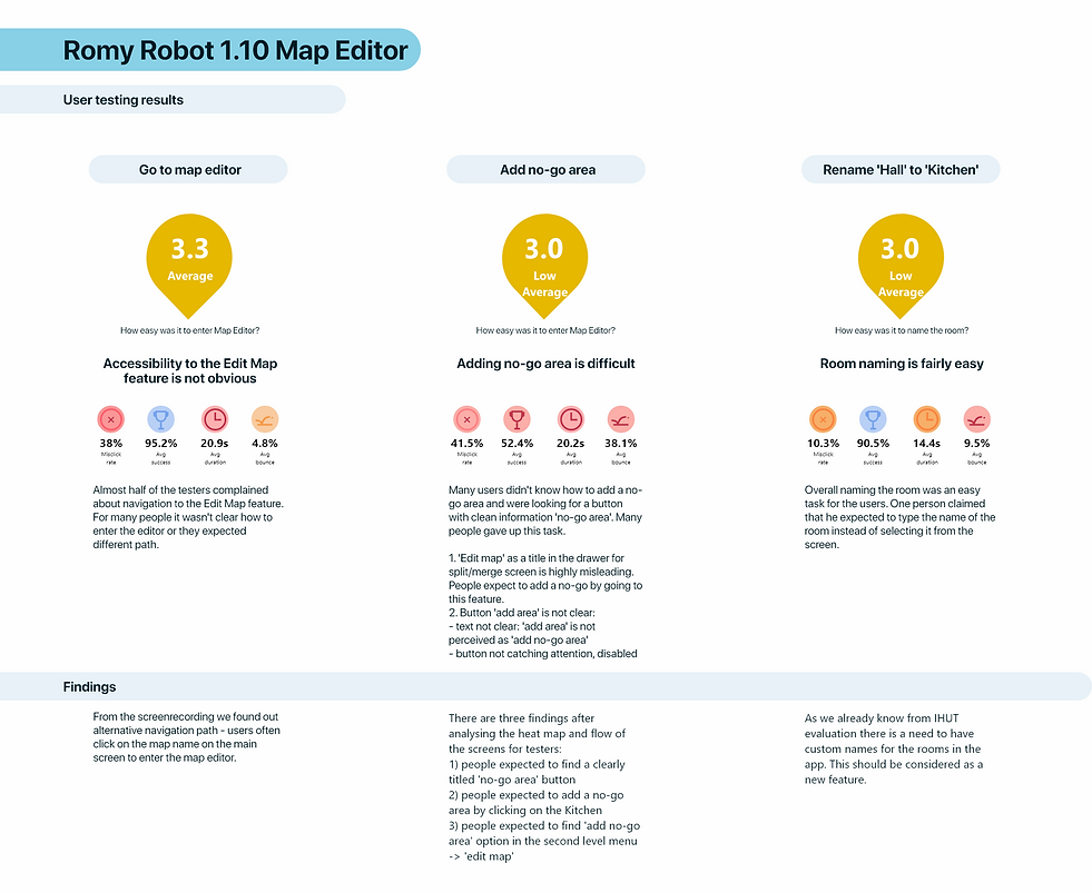
Edit map - case study
During the home test, we found out that one of the most challenging tasks is for a user to edit the map proposed by the robot. Due to the complexity of the households, many people need to split or marge suggested by the robot rooms or add additional cleaning or restrictive (no-go) areas.
Due to this finding UX team took a chance to evaluate the old edit map concept with the users and defined needed improvement. Before the concept was released for implementation further UX research was done.
Main role:
-
Evaluation of the old Edit Map concept with a group of 20 users
-
Briefing, leading and supporting UX/UI designer with ideation and creation of the new Edit Map concept
-
Evaluating the new Edit Map concept
-
A/B concept testing and evaluation
-
Conducting and summing up UX research regarding the new concept with a group of 20 users before implementation
-
Coordinating with the App team possibilities and planned solutions

01
Evaluating old edit map concept
During conducting an in-home use test with a robotic vacuum we found out that there is a huge need to improve the map editor in the app.
The first implementation of the map edit was hard to access and consisted of a two-level menu, as well as misleading texts.